How to make animated sprites using CSS
For as long as I can remember, I have always loved platformer games. I grew up playing and being obsessed with the Megaman X games for the SNES, where my brother and I would try and beat sigma over and over again while writing down the save codes on pieces of paper.
Let's make some sprites come to life.
Let's dive into how we can actually animate using pure CSS.
First, let's walk through how we are going to achieve this animation. I'm going to be using a sprite sheet (the only way I know how). A sprite sheet is an image that consists of several smaller images (sprites) and/or animations.*


The first thing I'll do when setting up a sprite sheet is to make sure that each sprite has the same dimensions. Madeline above is 80px width x 80px height. This is perfect because it makes the math super simple later.
Next, we are going to be using the CSS property background
background: url("./path_to_sprite.png") 80px 80px;
/*is the same as*/

background-image: url("./path_to_sprite.png");
background-position: 0px 0px;
We want to set our background-position to be the same size as our sprite dimension.
By default, a background image is placed at the top-left corner of an element and repeated both vertically and horizontally.
I like to think about the image below as a reference to what's happening. We want that black box to represent the size of our img.


That way we can move the background-position of our img and our box stays in the same place.
Let's plug that into the code playground and see what that gives us so far.
OH NO! Where is Madeline?
Don't worry she's just shy <3 let's try adding a height and width to the playground above. Do you remember the sprite dimensions?
img {
  height: 80px;
  width: 80px;
  border: 0;
  background: url("./path_to_madeline.png") 0px 0px;
}
Now that we have Madeline in view, let's get into the good shit, let's animate her.
@keyframes
We are going to be using CSS @keyframes. Each @keyframes rule contains a style list of keyframe selectors, which specify percentages along with the animation when the keyframe occurs, and a block containing the styles for that keyframe.
We can name our @keyframes just by using adding @keyframes in front of whatever we are going to be naming it. Let's name ours moveX
@keyframes moveX {}
A tip I use to remember this is how we use the function keyword before defining a function. So that would be like function myKeyframeName() in my head is like @keyframes myKeyframeName {}
The @keyframes need a beginning and an end for them to animate. They have reserved keywords from and to, which are the same as 0% and 100%. The easy way to think of this is that 0% is the beginning of the animation, 100% is when the animation is complete.
Well, we have Madeline but she's not doing anything at all. We even added in the @keyframes so why isn't it animating? We need to use the animate property.
Let's look at an example of one real quick.
@keyframes playX {
  from {
    background-position-x: 0px;
  }
  to {
    background-position-x: -400px;
  }
}


/*these are all pretty self exlapnitory. */
img{
  animation-name: playX;
  animation-duration: 0.5s;
  animation-timing-function: steps(5);
  animation-iteration-count: infinite;
}


/*Luckily CSS has a shorthand for us. */

img {
  animation: playX 0.5s steps(5) infinite;
}
Try adding the animate property to the playground above, see if you can get it working.
Let's break down this animation.
animation: playX ___ ___ ___;
/*The name of our animation*/animation: playX 0.5s ___ ___;
/*Next were adding the duration*/
/*of each step*/animation: playX 0.5s steps(5) ___;
/*We are adding 5 steps.*/
/*why 5? well becuase we have 5 sprites */
/*this will do 0.5s x 5 steps. */
/*for a total of 2.5s.*/animation: playX 0.5s steps(5) infinite;
/*This last one is the iteration count*/
/*infite will just keep on going*/
Let me break down steps() a little more real quick. You might have spotted that I added to our @keyframes the background-position-x
What it's saying here is lets start our background-position-x at 0px and end at -400px but why -400px and why background-position-x you ask? those are great questions.
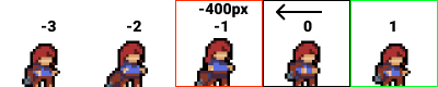
I wanna move Madeline forward, and to do that you have to think about moving the background-image in the correct direction. The image above shows that when I'm doing a negative px value it's going to move the image along the x-axis in a negative way. Almost like the arrow is pulling the image. I highlighted the direction it's going in Green and the one it's not going in the red.

This image above would show me pushing the image along the x-axis in a postie way. That would actually be pushing our background-image away from us. it would get our sprites out of sync.
@keyframes playX {
  from {
    background-position-x: 0px;
  }
  to {
    background-position-x: -400px;
  }
}
Remember my -400px is essentially pulling the image in the correct linear-direction we want.
The Final Climb
If you noticed above I mentioned a 5x5 image sprite sheet. Well silly, we are going to use it to make a dope animation.
We can actually have multiple @keyframes in a CSS animation.
Try adding another @keyframes animation above. I'll paste one below, but try doing it yourself first.
@keyframes playY {
  from {
    background-position-y: 0px;
  }
  to {
    background-position-y: -400px;
  }
}

img {
 animation: playX 0.5s steps(5) infinite,
  playY 2.5s steps(5) infinite;
}
Oh dang, that is cool. I can just add that next animation in by using a , to separate them.
You can see that I have something going on with the playY animation.
 animation: playX 0.5s steps(5) infinite,
  playY 2.5s steps(5) infinite;

  /*playX takes 2.5s to run. */
  /*So i want my playY animation to */
  /*run every 2.5s so that way playX made it */
  /*all the way through.*/
Thanks for reading <3
I found some sprites of Madeline here